
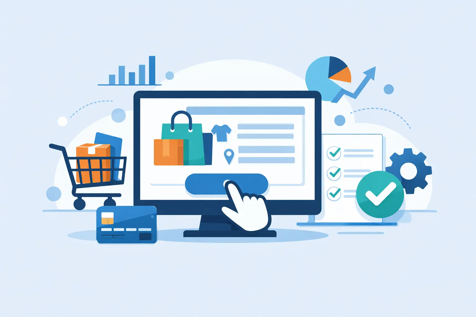
A lot of online stores do the hard work of getting traffic, earning product interest, and building trust – then lose the sale in the last two minutes. That is why custom ecommerce checkout optimization matters. If your checkout is slow, confusing, or disconnected from the way your customers actually buy, every improvement you make upstream has less impact.
For growing businesses, checkout is not just a design detail. It is where customer experience, payment systems, mobile usability, and backend logic all meet. A generic checkout can work well enough to launch. But once you start seeing abandoned carts, customer service complaints, or limits in your platform, a custom approach often becomes the better business decision.
What custom ecommerce checkout optimization really means
Custom ecommerce checkout optimization is the process of improving the checkout flow based on your products, customer behavior, and operational needs instead of accepting a default setup as-is. That can include interface changes, payment logic, shipping rules, field reduction, mobile improvements, CRM integration, tax handling, and post-purchase automation.
The key point is that optimization is not only about making a page look cleaner. It is about removing friction without creating new problems elsewhere. A faster checkout that increases fraud risk, breaks reporting, or confuses your fulfillment team is not a real win. The best work balances user experience with operational reliability.
For some stores, the right move is a light customization of an existing platform. For others, especially those with subscription models, B2B workflows, nonprofit fundraising components, or unusual fulfillment rules, a more tailored build makes sense. It depends on how much the default checkout fights your process.
Where most checkouts lose revenue
Checkout problems usually show up in predictable places. The first is forced effort. If customers have to create an account before buying, re-enter information the site already knows, or tap through too many screens on mobile, some will leave even if they intended to purchase.
The second issue is uncertainty. Unexpected shipping costs, unclear delivery timing, limited payment options, or vague error messages create hesitation. At checkout, hesitation is expensive. People do not need many reasons to postpone a purchase.
The third issue is technical friction. Slow load times, coupon fields that distract from completion, payment gateways that fail silently, or autofill that does not behave properly can quietly damage conversion rates. These issues are common because they sit between design, development, and third-party tools. They are easy to miss unless someone is looking at the full system.
When custom optimization is worth it
Not every business needs a deeply customized checkout from day one. If you have a simple catalog, standard shipping, and healthy conversion rates, your money may be better spent on acquisition or product page improvements first. But there are clear cases where custom work earns its keep.
If your checkout has to support multiple user types, region-specific rules, donations plus products, wholesale pricing, subscriptions, financing options, or complicated integrations, default templates can become restrictive fast. You start adding apps, plugins, and workarounds until the process feels patched together. At that point, optimization is no longer about preference. It is about reducing complexity and making the system dependable.
This is also true when internal teams are wasting time manually fixing orders, answering avoidable checkout questions, or reconciling disconnected customer data. A better checkout is not only a conversion project. It can also be an operations project.
Custom ecommerce checkout optimization starts with behavior, not guesses
The most effective checkout improvements usually come from evidence. Before changing layouts or adding features, look at where users drop off, what devices they use, which payment methods convert best, and where support requests cluster. Session recordings, analytics funnels, form analytics, and failed payment reports all help.
This matters because checkout decisions are full of trade-offs. A one-page checkout may feel faster, but for some audiences it can feel crowded and harder to scan. Adding more payment options can improve conversion, but too many logos and choices can create visual noise. Showing every available shipping method upfront sounds transparent, yet it may overwhelm buyers if the options are poorly labeled.
A practical team will test changes in order of impact. Start with the issues closest to purchase completion: field count, mobile usability, payment clarity, error handling, and speed. Cosmetic changes come later.
The highest-impact areas to review
Field reduction is often the easiest win. If a form asks for information that is not required to process the order, remove it or move it later. Every extra field adds time and increases the chance of errors.
Payment flexibility is another major lever. Customers expect to pay the way they prefer, whether that means cards, digital wallets, express options, or invoicing for certain business accounts. The right mix depends on your audience. A consumer brand may need Apple Pay and PayPal. A B2B seller may need purchase order logic or approval workflows.
Mobile flow deserves its own review. On many stores, mobile traffic is high while checkout conversion lags behind desktop. That gap usually points to usability problems, not lack of intent. Button placement, keyboard behavior, autofill support, sticky order summaries, and tap target size all affect completion rates.
The backend side of checkout matters too
A checkout can look polished and still create downstream problems. If order data does not map cleanly into your CRM, ERP, email platform, or fulfillment process, the customer experience suffers after the purchase. That can lead to duplicate records, delayed follow-up, incorrect shipping communication, or extra manual work for staff.
This is where custom development becomes especially valuable. A well-planned checkout should fit into the broader digital ecosystem, not sit apart from it. When customer, payment, inventory, and marketing systems are connected properly, you get better reporting and fewer handoffs. That creates a more stable operation and gives your team cleaner data to act on.
For businesses with recurring support needs, this also makes future improvements easier. A checkout built with clear logic and maintainable code is simpler to update than a fragile setup held together by conflicting third-party extensions.
Design choices that improve trust at the point of sale
At checkout, trust is practical. Customers want to know what they are paying, when they will receive it, and what happens if something goes wrong. Strong custom ecommerce checkout optimization reinforces those answers without cluttering the screen.
That usually means visible order totals, clear shipping expectations, readable field labels, concise error states, and reassurance around payment security. It may also mean simplifying discount code behavior so promotions support conversion instead of becoming a distraction.
Trust cues should match the audience. A consumer store might benefit from wallet options and delivery estimates. A nonprofit or service-based organization may need stronger messaging around recurring payments, tax receipts, or billing transparency. Good checkout design reflects the actual buying context.
Why speed and support matter after launch
Checkout optimization is not a one-time task. Payment providers change, devices change, customer expectations change, and platform updates can affect functionality. That is why post-launch support matters as much as the initial build.
A dependable process includes monitoring errors, reviewing analytics regularly, and updating the flow when customer behavior shifts. Sometimes a checkout problem is obvious, like a broken payment button. More often, it is gradual, such as a rising drop-off rate on a specific step or a decline in mobile conversion after a theme update.
This is where an execution-focused agency approach helps. The work is not about adding complexity for its own sake. It is about making targeted improvements, validating results, and keeping the system stable over time. That is the kind of practical support teams need when revenue depends on the last step working correctly.
For organizations that want checkout to perform as well as the rest of their digital presence, a custom strategy is often the difference between a store that functions and a store that scales. codepxls approaches that work the same way it approaches broader digital systems – with clear planning, clean implementation, and support that continues after launch.
If your checkout is costing you sales, the fix is rarely one dramatic redesign. It is usually a series of disciplined improvements that make buying easier for customers and order handling easier for your team.