A donation form that cannot be used with a keyboard is not a minor website issue. For a nonprofit, it can block giving, prevent access to services, and create legal exposure at the same time. That is why nonprofit website accessibility requirements should be treated as part of core operations, not a design extra.
For most nonprofit leaders, the hard part is not understanding why accessibility matters. It is figuring out what is actually required, what is considered best practice, and how far to go with limited budget and staff time. The short answer is this: if your organization serves the public online, your website should be accessible to people with disabilities, and the safest practical standard is WCAG compliance.
What nonprofit website accessibility requirements actually mean
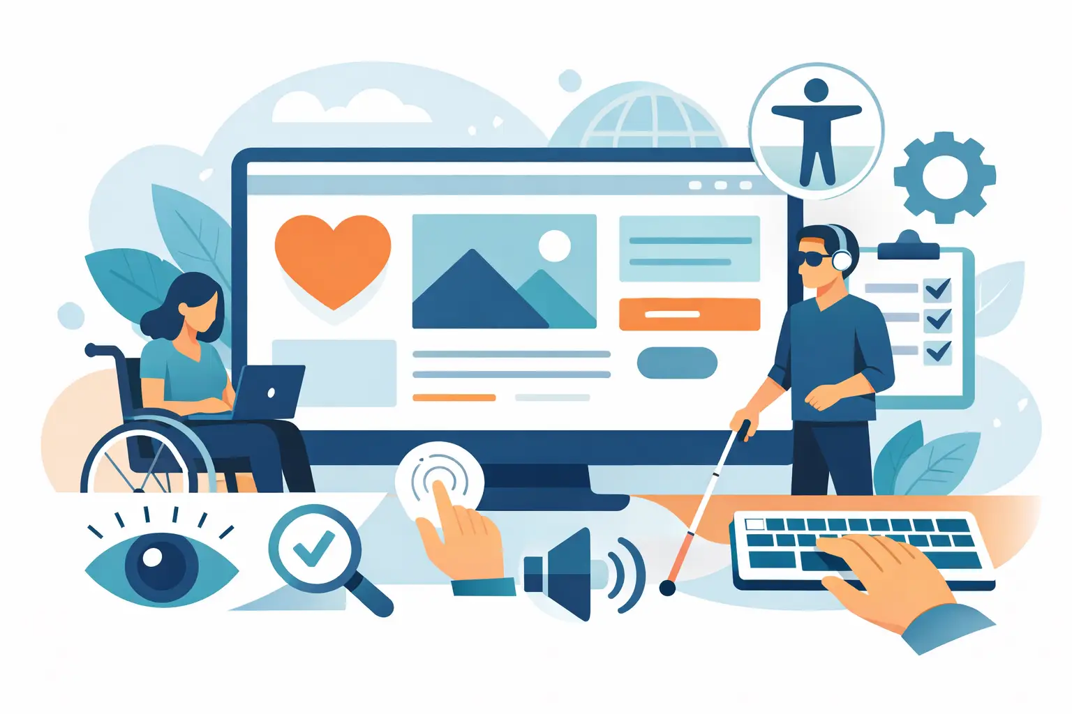
Accessibility means people with visual, hearing, motor, and cognitive disabilities can use your site without unnecessary barriers. That includes reading content with screen readers, moving through menus by keyboard, understanding forms, watching videos with captions, and completing important tasks without confusion.
Legally, the picture is not always as neat as people want it to be. In the US, nonprofits may fall under the Americans with Disabilities Act depending on the nature of the organization, its services, and how the public uses its website. Some nonprofits assume they are exempt because they are not a business. That is not a safe assumption, especially if the website is a public-facing channel for education, applications, donations, registrations, events, or community services.
In practice, courts and legal demand letters often point back to one benchmark: the Web Content Accessibility Guidelines, usually WCAG 2.1 Level AA. That standard is not a federal law by itself, but it is the most widely accepted measuring stick for accessible web design and development.
The standard most teams use
If you want a practical answer to nonprofit website accessibility requirements, aim for WCAG 2.1 AA unless you have a specific reason to follow a stricter or newer version. WCAG is built around four principles. Your site should be perceivable, operable, understandable, and robust.
Perceivable means users can detect and consume the information. Images need text alternatives. Color contrast must be strong enough to read. Video needs captions when speech matters.
Operable means users can navigate and interact with the site. A person who cannot use a mouse should still be able to move through menus, buttons, forms, and popups with a keyboard.
Understandable means the site behaves in clear, predictable ways. Form errors should explain what went wrong. Navigation labels should make sense. Page structure should not force users to guess.
Robust means your site works with assistive technologies and modern browsers. Clean code, proper HTML structure, and correct ARIA usage all matter here.
Where nonprofits usually run into trouble
Most accessibility problems are not caused by one major failure. They come from dozens of small decisions made over time. A redesign launches with strong visuals but weak heading structure. A third-party donation tool looks polished but traps keyboard focus. Staff upload PDFs that are unreadable to screen readers. Event images go live without alt text because everyone is moving fast.
For nonprofits, the highest-risk areas are usually donation flows, contact forms, volunteer applications, event registration, resource libraries, and program eligibility information. These are not just marketing pages. They are access points to funding, help, and participation.
That is why accessibility work should start with user-critical paths instead of a blanket effort to fix everything at once. If someone cannot donate, apply, register, or get information because the interface fails them, the problem is immediate.
Common requirements that should be on your checklist
A strong accessibility review usually covers the basics first. Images need meaningful alt text when they convey content. Headings should follow a real structure instead of being used only for styling. Links and buttons must have clear labels. Forms need associated labels, useful instructions, and readable error messages.
Your site should be usable by keyboard alone. That includes dropdowns, navigation menus, accordions, modal windows, and embedded tools. Color cannot be the only way information is communicated. Text should meet contrast standards. Videos should have captions, and audio-only content should have transcripts when appropriate.
There are also backend and coding requirements that users never see directly but feel immediately when they are done wrong. Landmark regions, focus order, skip links, semantic HTML, page titles, and proper labeling for custom components all play a role.
If your organization posts PDFs, annual reports, grant materials, intake forms, or policy documents, document accessibility matters too. A highly accessible website can still create barriers if the files it offers are unusable.
Automated scans help, but they are not enough
This is where many organizations get misled. An accessibility plugin or scanner can catch missing alt text, low contrast, and some structural issues. That is useful. It is not a full compliance strategy.
Automated tools typically catch only a portion of real accessibility problems. They do not reliably judge whether alt text is meaningful, whether a screen reader experience is logical, or whether a donation flow becomes confusing halfway through. They also cannot fully test how accessible your third-party tools are.
Manual testing is what turns a checklist into a real answer. That includes keyboard testing, screen reader testing, form testing, and mobile testing. If your website powers important public services, this is not optional.
Accessibility has a budget side, but delay has a cost too
Some nonprofit teams worry that accessibility means rebuilding the entire website. Sometimes it does require a larger redesign, especially if the platform is outdated or the theme is poorly built. More often, the answer is phased remediation.
A practical approach starts with an audit, then prioritizes fixes based on risk and user impact. The home page matters, but your donation form may matter more. Your blog archive matters, but your service directory may matter more. Good planning keeps the work grounded in business and mission priorities.
There is a trade-off here. A quick patch can reduce immediate risk, but it may leave deeper structural issues in place. A full rebuild can solve more problems cleanly, but it requires more time and budget. The right choice depends on your current platform, your internal capacity, and how central the website is to daily operations.
Accessibility is not just about legal protection
Yes, legal risk is real. But that should not be the only reason a nonprofit pays attention. Accessible websites are usually better websites overall. They are easier to navigate, easier to read, and easier to use on mobile devices. They also tend to perform better for older users, distracted users, and anyone dealing with temporary limitations like a broken mouse or a noisy environment.
For nonprofits, that overlap matters. Your audience may include donors in their seventies, caregivers using phones one-handed, job seekers filling out forms from public computers, or community members who rely on assistive technology every day. Accessibility improves reach because it reduces friction.
It also supports trust. When a website is clear, readable, and functional, the organization behind it looks competent and attentive. That matters for fundraising as much as it does for service delivery.
How to handle nonprofit website accessibility requirements in a realistic way
Start by identifying your highest-value user journeys. Usually that means donation, contact, service access, event registration, and application processes. Audit those first. Then review templates, navigation, forms, media, and documents.
Next, decide whether your site needs remediation or replacement. If your content management system and theme are flexible enough, targeted fixes may be enough. If the site is built on a brittle framework with heavy visual shortcuts and inaccessible plugins, continued patching can cost more than rebuilding.
Then create an ongoing process. Accessibility is not a one-time project because websites change constantly. Staff upload new content, campaigns come and go, plugins update, and third-party tools get swapped in. Clear publishing standards, developer review, and periodic audits keep the site from slipping backward.
This is where working with an experienced team matters. Accessibility touches design, code, content, integrations, and quality assurance. A practical partner will not just hand you a report. They will help you sort fixes by impact, work within your budget, and make sure the solutions hold up after launch.
A note on accessibility statements and policies
Many nonprofits add an accessibility statement to their website. That can be helpful, especially when it explains your standards, provides a contact method for reporting barriers, and shows good-faith effort. But it is not a substitute for actual accessibility.
The same goes for internal policy. Staff should know how to write alt text, upload accessible documents, and avoid content choices that create barriers. A polished homepage does not solve the problem if weekly updates are introduced in inaccessible ways.
Nonprofit website accessibility requirements are best handled as part of website governance, not as a one-off legal reaction. When accessibility is built into planning, design, development, and content management, the website becomes easier to maintain and more useful to the people who depend on it.
If your nonprofit website plays a real role in how people give, learn, apply, or get help, accessibility is already part of the job. The smart move is to address it before a user, donor, or attorney points out what was missed.